Animated Wind Maps Are Up in Beta Form
I’ve been working on this for the last week or so; it’s still a little rough, but I think it’s far enough along to be worth unveiling. Anyway, check it out: Southern California wind observations.
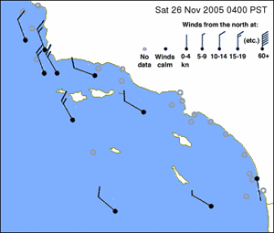
I’m currently producing a static map showing the latest hour’s wind data from NOAA’s National Data Buoy Center; in addition there are animated maps showing the previous 6, 24, and 72 hours. The maps are updated at 30 minutes past the hour, by which time most of the buoys have uploaded their previous hour’s data.
On my to-do list are the following:
- Fiddling with the little wind icons to make them antialias better.
- Adding some sort of analog time display to make it easier to track the passage of time in the animations.
- Adding additional maps for other locations (the buoy data at NDBC covers all US coastal waters, as well as a number of other regions in other parts of the world).
I think it’s pretty cool, in terms of the concept, at least, and I’ll keep working on improving the execution. I’d be interested in getting feedback on how the wind maps could be improved, either privately via email at feedback@socalsail.com, or publicly using the weblog’s comment form.
Thanks!